Art Now is a continuing ed based lecture series
Designed promotional materials for a continuing education lecture series featuring visiting artists. Each piece was tailored to the featured speaker, using image-driven layouts and color palettes drawn directly from the artwork to reflect the tone of the upcoming lecture.
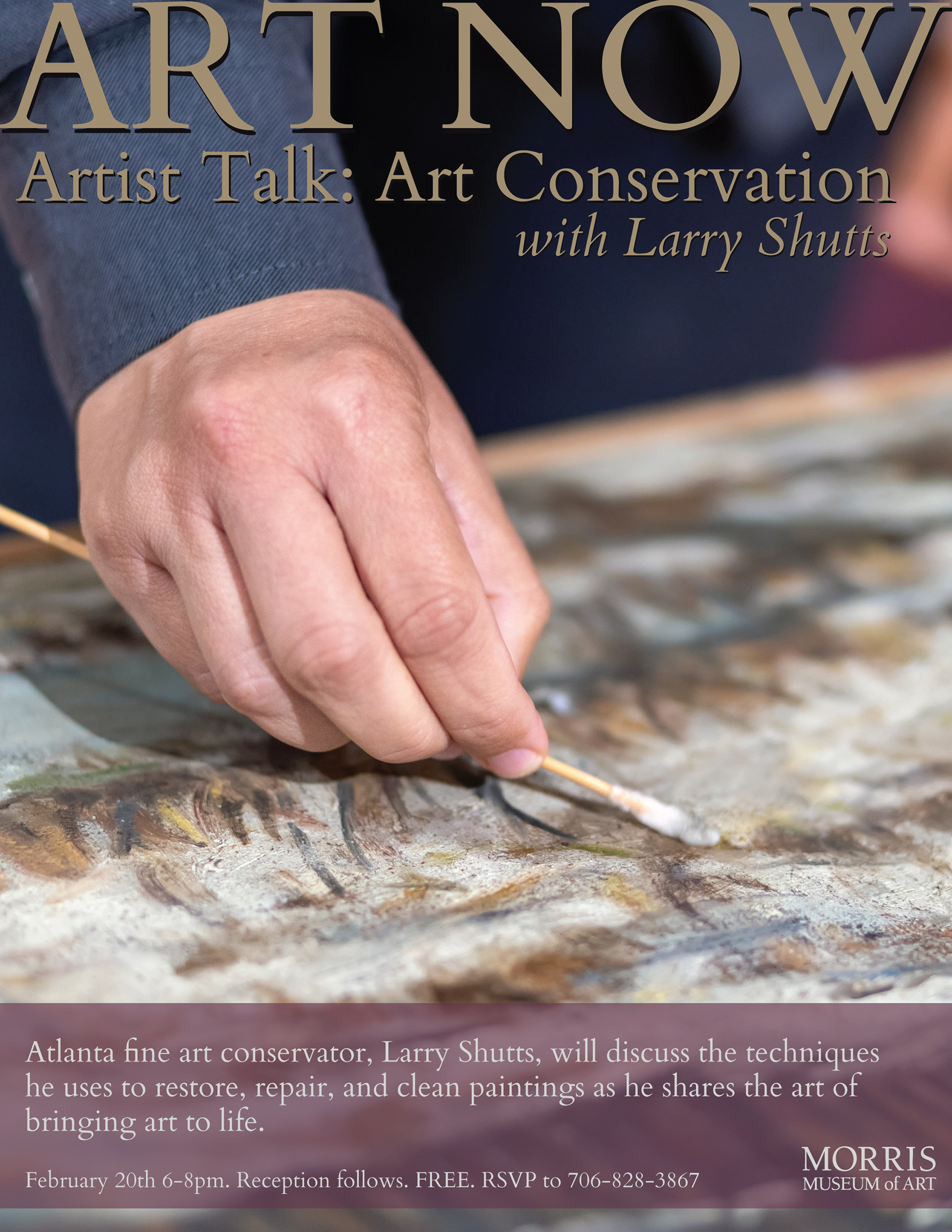
For the first lecture, a low-resolution source image required selecting a high-quality alternative while maintaining the intended mood. A magazine-inspired layout and subtle transparency treatments were used to improve text readability and guide visual flow.
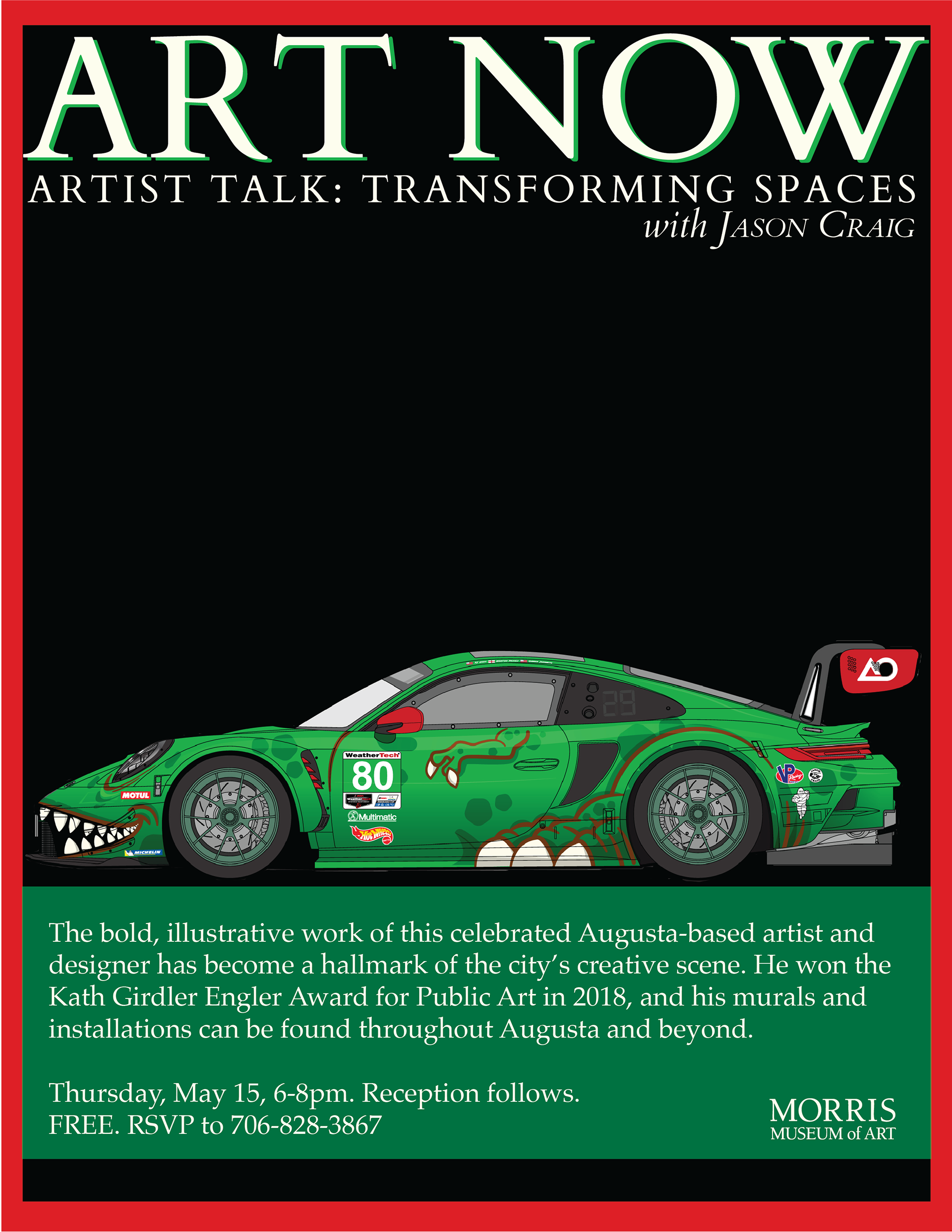
For the second lecture, a bold mural image informed a more graphic approach. A high-contrast palette, structured layout, and consistent Art Now branding elements (masthead and footer) created a cohesive yet dynamic system across the series.
Honestly one of my funnest projects.